Climate Engine App Adds New Masking, Base Maps, and Overlay Functionality
Article Table of Contents
Summary of New Updates
As of October 2, 2025, Climate Engine introduces new capabilities that give users greater flexibility and precision in analyzing spatial and temporal data, while also supporting visualization of additional map layers. These updates are reflected in several changes to the user interface. There are three core features of these updates, 1) categorical raster masks, 2) custom base maps, and 3) raster map overlays.
Categorical Raster Masks
The new categorical raster masking functionality applies to both maps and graphs made in Climate Engine and allows users to subset their computed map layers and timeseries analysis based on categorical datasets such as land ownership, landcover, or wetland types. For example, users can now subset their maps of summer Normalized Difference Vegetation Index (NDVI) trends to Valley Bottom Extraction Tool (VBET) extents, allowing riparian assessments to be masked to predefined valley bottom areas across broad regions—without the need to manually upload or draw polygons.
Fig 1. Trend map of June, July, August mean NDVI in Elevated and Lowlying Valley Bottom.
The new raster masking functionality allows users to select up to two masking layers with various categories within each masking layer. One of the layers that is available for masking is the Surface Management Agency dataset maintained by the Bureau of Land Management. When using the Surface Management Agency mask, users can select land management agencies such as the Bureau of Land Management, National Park Service, and U.S. Forest Service to focus their analysis on specific land ownership types. Users can select as many categories as are available in each layer. When multiple categories are selected within a single masking layer, the output is always the union of those categories (e.g., choosing both National Park Service and Bureau of Land Management results in an analysis of all lands managed by either agency). By contrast, when two distinct masking layers are applied together, users can choose whether the output is based on their intersection (i.e., only locations where selected categories in both datasets overlap) or on their union (see step-by-step examples below).
Masking can be applied to both maps and graphs in Climate Engine, enabling users to focus their maps on specific areas of the landscape and to subset their time series analysis based on their needs. For example, users are now able to produce timeseries charts of summer NDVI for the low-lying or elevated valley bottoms in the VBET extent for regions of interest like grazing allotments, HUCs, etc.
Fig 2. Summary timeseries of June, July, August mean NDVI in Lowlying Valley Bottom.
Custom Base Map
The new custom base map functionality allows users to add high-resolution imagery and high-resolution digital elevation models (DEMs) as an additional base map layer (above the standard base map and below the Climate Engine computed map). For example, if a user is interested in what an area looked like prior to a restoration action, they can select a National Agriculture Imagery Program (NAIP) layer, specify the year of interest, and select between true color, color infrared, or NDVI layers to visualize in the map. Additional layers include historical imagery provided by USDA-NRCS and high-resolution slope and hillshade layers from the US Geological Survey’s 3DEP program. Alongside Climate Engine’s core functionality, these new basemap layers provide essential context for interpreting timeseries trends and landscape patterns. For best performance, users must zoom into their area of interest before turning on the custom base map.
Fig 3. NDVI calculated from 2022 NAIP Imagery.
Raster Map Overlays
The new overlay raster map overlay functionality allows users to add different raster layers as visual overlays to the map window above the Climate Engine computed map. For example, if you were interested in viewing wetland types you could select the National Wetland Inventory (NWI). This adds all wetland and riparian layers in NWI to the map and adds a transparency toggle to the top right of the map. Legends for the raster map overlays are found in the Map Overlays dropdown menu.
Fig 4. NWI overlay on NDVI trend map.
Changes to the User Interface
To accommodate the new functionality described above, the Climate Engine team made some changes to the organization of the “Make Map” and “Make Graph” tabs on the left side of the interface and to the mapping options dropdown menus above the map. In the mapping and graphing tabs, users will now see a new “Masking” section, which provides options of “No mask”, “Mask by value”, and “Mask by category”, with “No mask” selected by default. Prior to these changes, the dropdowns above the map were “Colors”, “Map”, “Layers”, “Masking”, and “Download.” All of the functionality from these dropdowns remains but several features have been reorganized, with the new dropdown options being “Base Maps”, “Computed Map”, “Map Overlays” and “Download.”
The new dropdown menus provide specific controls for layers presented in the maps. The “Base Maps” dropdown provides the standard Climate Engine base maps (which used to be in the “Map” dropdown) and the new Custom Base Map options. The “Computed Map” dropdown provides styling options for the main map layer produced using the forms in the “Make Map” tab”, this feature moved from the “Colors” dropdown. The “Map Overlays” dropdown provides static raster and vector map layers that can provide context alongside the other layers in the map; the raster map layers are new and the vector map layers used to be in the “Layers” dropdown. The “Download” dropdown remains unchanged.
Step By Step Examples
Adding a Custom Base Map to the Mapping Window
Open up the Climate Engine App in your browser. Above the map you will see a drop-down labeled Base Maps. Open the drop-down and scroll to the Custom Base Map section.
Fig 5. Base Maps window for selecting custom base maps.
Here you will see toggles for the different raster options. The default is set to None. To learn more about each data option, click on the (?) next to the layer. This will direct you to a documentation page. You can only select one option at a time. If you are selecting an option with year options, update the drop down to the year of interest. Then click the circle next to the layer of interest to turn it on. This will add the layer to the map. The Legend will appear below the Status section. Note: Not all years have imagery for all areas. If you select a Custom Base Map with year options, green text noting years available will appear when that option is selected. Additionally, for best performance, zoom in to the area of interest on the map before selecting the layer.
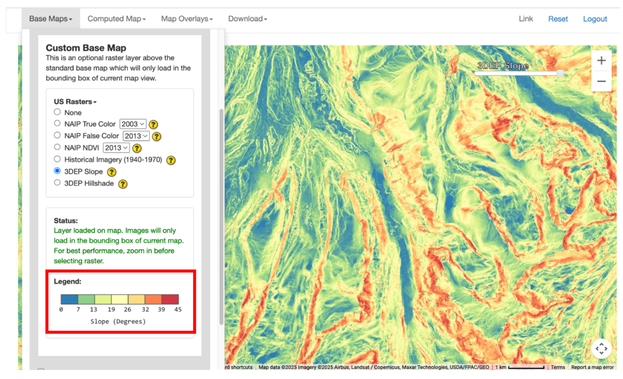
Fig 6. Custom base map legends are shown in the “Base Maps” dropdown menu.
To control the visibility of the custom base map just added, you can adjust the transparency toggle added to the map.
Adding an Overlay to the Mapping Window
Open up the Climate Engine App in your browser. Above the map you will see a drop-down labeled Map Overlays. Open the drop-down and scroll to the Raster section.
Fig 7. Map overlays window for selecting raster and vector overlays.
Here you will see toggles for the different raster options. The default is set to None. To learn more about each data option, click on the (?) next to the layer. This will direct you to a documentation page. You can only select one option at a time. Then click the circle next to the layer of interest to turn it on. This will add the layer to the map above any base maps or computed maps. The Legend will appear below the Status section.
Fig 8. Selection status update section of overlay window.
To control the visibility of the custom base map just added, you can adjust the transparency toggle added to the top right of the map.
Creating a Masked Map Output
Navigate to the Make Map tab on the left hand panel of the App. A new section has been added to the panel: Masking. This allows three options: 1) No mask (shows all values on the map), 2) Mask by value (allows below, above, exterior, and interior thresholds), and 3) Mask by category (shows values within defined areas).
Fig 9. Masking section of the Make Map tab.
You can only choose one option at a time. This example will focus on the Mask by category. When you select this option, you are provided two drop-down menus. The first drop-down, Masking Layer, lists the masking layers you can select from. Once a masking layer is selected, the Masking Category drop-down will be populated with the categories to select from. Multiple categories can be selected and the resulting mask will be a union of those categories. If you are interested in all available categories you can click the Check All box. Then you can fill out the rest of the mapping panel as usual and click Compute Map. The computed layer will be added to the map.
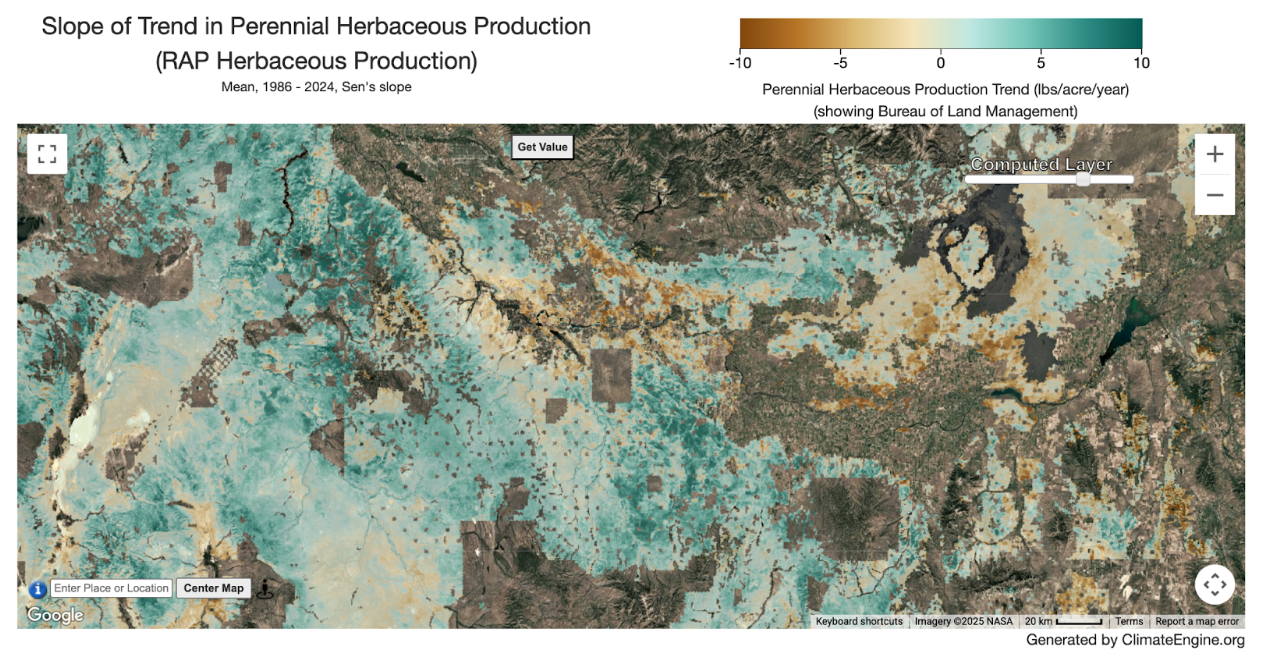
Fig 10. Trend in RAP Perennial Herbaceous Production for areas under BLM management.
To control the visibility of the computed map just added, you can adjust the transparency toggle added to the map. There is the option to combine the first mask with a second mask by either taking a union of the two masks or intersection of the two masks. To do this, click the (+) Show second mask option. Check the box next to the Intersect/Union dropdown and choose the type of join between the two masks.
Intersect will result in showing areas that are categories selected for mask 1 AND categories selected for mask 2, e.g. areas that are BLM lands and Valley Bottom. Union will result in showing areas that are categories selected for mask 1 OR categories selected for mask 2, e.g. areas that are Riverine (NWI) and Valley Bottom. To go back to one mask, uncheck the Intersect/Union dropdown between the Masking Layers and select the Hide second mask option text that is now shown.
Fig 11. Masking section of the Make Map tab extended for a second mask.
Once Masking Layers and Masking Categories are all selected, then you can fill out the rest of the mapping panel as usual and click Compute Map. The computed layer will be added to the map.
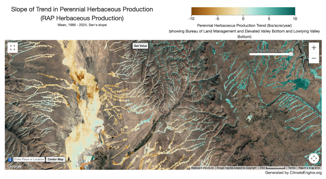
Fig 12. Trend in RAP Perennial Herbaceous Production for areas under BLM management.
Creating a Masked Chart Output
Navigate to the Make Graph tab on the left hand panel of the App. A new section has been added to the panel: Masking. This allows two options: 1) No mask (shows all values on the map) and 2) Mask data by category (computes values within defined areas). If you used masking in the Make Map tab, this section may be already filled out. Selecting masks works the same for the Make Graph tab as the Make Map tab described above. The timeseries values will only reflect the desired areas according to the masking within the region, rather than values for the entire region. One important note is the timeseries masking only works for polygon regions. If you select a point, an error will be returned.
Fig 13. Masking section of the Make Graph tab.
This example will focus on the Mask data by category. When you select this option, you are provided two drop-down menus. The first drop-down, Masking Layer, lists the masking layers you can select from. Once a masking layer is selected, the Masking Category drop-down will be populated with the categories to select from. Multiple categories can be selected and the resulting mask will be a union of those categories. If you are interested in all available categories you can click the Check All box. Then you can fill out the rest of the graphing panel as usual, including defining your “Region” and click Compute Time Series. The graph will display in the graph tab. Information about the mask is added to the figure caption.
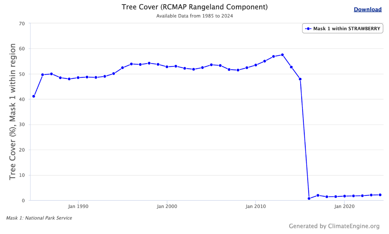
Fig 14. Graph of RCMAP Annual Tree Cover % within Strawberry Fire perimeter on NPS lands.
Users can also perform a Two Variable Analysis, applying masks independently to each variable. For example, this allows users to analyze timeseries of remote sensing or climate datasets over the same region based on different Surface Management Agencies. In this example, we extract tree cover on National Park Service and Bureau of Land Management lands for a wildfire perimeter from 2016. Information about each mask is added to the figure caption and labels for “Mask 1” and “Mask 2” are added to y-axis titles, legend, and the tooltip when hovering over a datapoint in the figure.
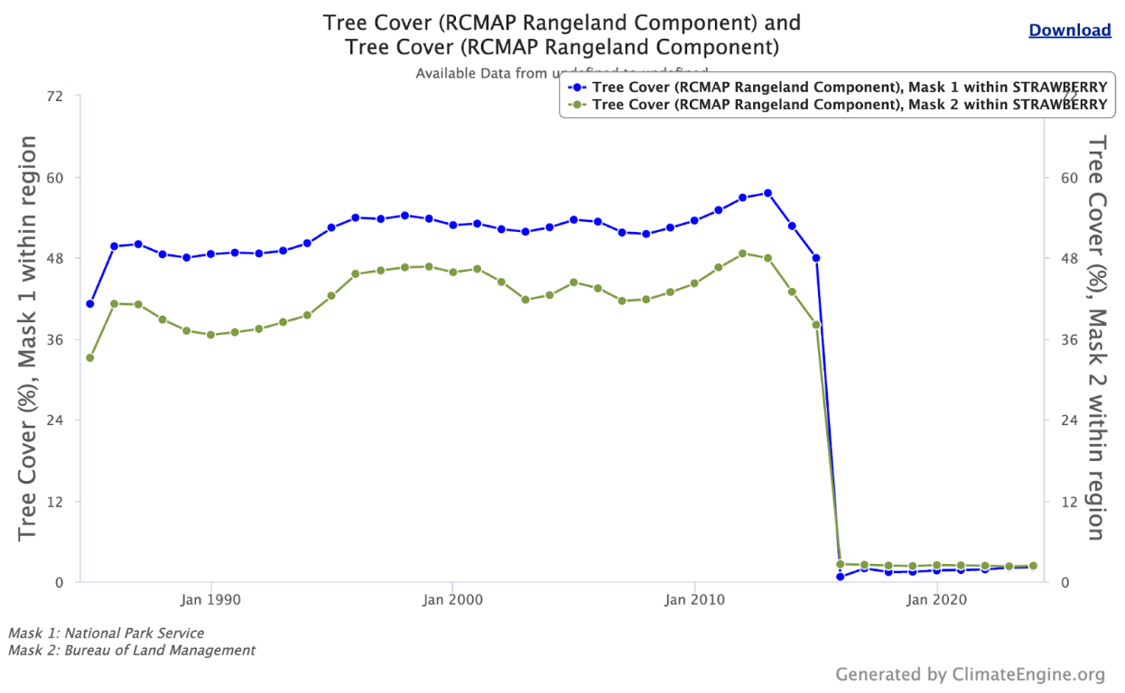
Fig 15. Graph of Annual Tree Cover % within Strawberry Fire perimeter on NPS vs BLM lands. The